Monday, 14 November 2011

Gestalt


This is an example of similarity and proximity. The three similar trees are grouped as one. And the one tree placed further away is classed as another group.


Good continuation - We assume that these buildings carry on behind the ones in front and don't just end randomly


Common Fate - direction of flow - the direction of flow is interrupted by the bus joining from the other lane. In purposely attracts your eye to where the action will take place.

Friday, 11 November 2011

Aliasing and anti-aliasing

In digital signal processing, spatial anti-aliasing is the technique of minimizing the distortion artifacts known as aliasing when representing a high-resolution image at a lower resolution.


This image shows the difference between bitmap images and vector images. They both look similar from a far, but when you zoom in close to a bitmap image (image on the right) it becomes very pixelated and distorted as they are not of a high quality like the vector images. If you zoom into a vector image it is still of the same quality and very clear.


Since bitmap images are just a grid of pixels, they can’t be easily scaled up. The only way to enlarge the image is to make the pixels larger, which makes the images look blocky. With vector images, the shapes that make up the image can be scaled up or down smoothly.


Anti-aliasing is the process of making the edges in images/video smoother. For example, the jagged edges in the bitmap image can be deteced and smoothed out so it is more pleasing to the eye and looks for better quality.

Wednesday, 9 November 2011

Mood Board


Here are some ideas of what i would like to incorporate into my work but obviously being drawn. My mood board includes some of the colours i would like to use, such as vibrant and bold colours rather than dull as this shows the atmosphere of the film will be bright and bubbly. The outfits i have looked at are designer outfits as this would portray the personality of my main character. The luxurious rooms are ideas of what the characters apartment could look like and how to make it look expensive through use of space, colour and props.

Monday, 31 October 2011

Typography Ideas


The idea behind these examples are as if its handwritten by the main character, then scribbled or crossed out

Angie Taylor said that, "One way you can make your designs stand out from the rest is by designing your own lettering". I think this is very true as many fonts you find on your computer are so typical and familiar to our eyes so to make something different and unique, you have to create it yourself as it will be something completely different that people are not used to seeing, therefore it will stand out next to all the recognisable ones.


I like these as the font is quite bold and playful as will the title sequence be, so it will inisiate what the film genre will be.


Out of these fonts, i think the second one will portray the film the best, as the font type looks like its written by a girl, therefore it fits in with the idea that a girl had wrote it in her diary.

Formal and Informal Compositions


Formal


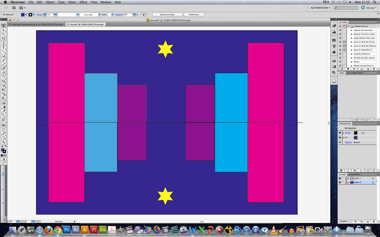
This was an experimental Illustrator drawing of a formal composition. The use of symmetry and geometrical shapes makes this composition formal.


This was an experimental attempt of informal composition, where the objects are scattered around and aren't positioned in a particular way.

Logo Ideas


My first idea was the Logo 'P.Production' with a mark of a hand drawn pencil. The idea of a hand drawn pencil is to show aspects of fun and playful rather than strict and serious.

My second idea is to use a 'big mark and small logo' type. This is to highlight the main aspect of fun. Although the pencil is neater, it still doesn't show signs of strict and serious.

My third logo idea was plain and simple with just the 2 P letters but one mirroring the other. This was to keep it straight to the point and precise. The colours would reflect the fun aspect.

Friday, 28 October 2011

Sketches


This is an image of a gate i drew with the idea of symmetry in mind.


This is an image of a fireplace i drew using different size squares. This could also be used as a setting in my final product.


This is an image i drew of my main character.


Character from side view


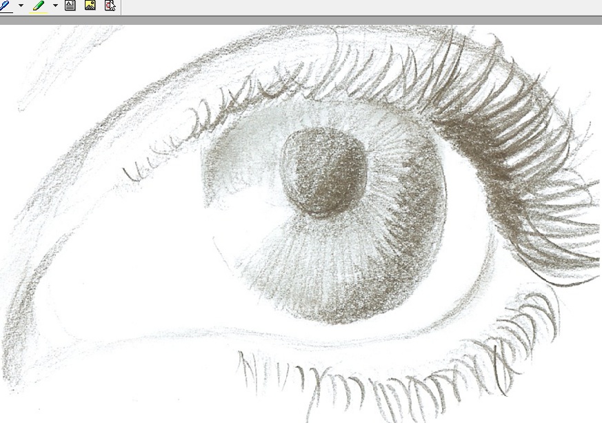
As i am not a very confident drawer, this was one of my first sketches which i was proud of. I tried to add in as much detail by use of shading.


This is also an idea for a setting for my final product