Monday, 31 October 2011

Typography Ideas


The idea behind these examples are as if its handwritten by the main character, then scribbled or crossed out

Angie Taylor said that, "One way you can make your designs stand out from the rest is by designing your own lettering". I think this is very true as many fonts you find on your computer are so typical and familiar to our eyes so to make something different and unique, you have to create it yourself as it will be something completely different that people are not used to seeing, therefore it will stand out next to all the recognisable ones.


I like these as the font is quite bold and playful as will the title sequence be, so it will inisiate what the film genre will be.


Out of these fonts, i think the second one will portray the film the best, as the font type looks like its written by a girl, therefore it fits in with the idea that a girl had wrote it in her diary.

Formal and Informal Compositions


Formal


This was an experimental Illustrator drawing of a formal composition. The use of symmetry and geometrical shapes makes this composition formal.


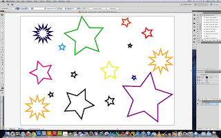
This was an experimental attempt of informal composition, where the objects are scattered around and aren't positioned in a particular way.

Logo Ideas


My first idea was the Logo 'P.Production' with a mark of a hand drawn pencil. The idea of a hand drawn pencil is to show aspects of fun and playful rather than strict and serious.

My second idea is to use a 'big mark and small logo' type. This is to highlight the main aspect of fun. Although the pencil is neater, it still doesn't show signs of strict and serious.

My third logo idea was plain and simple with just the 2 P letters but one mirroring the other. This was to keep it straight to the point and precise. The colours would reflect the fun aspect.

Friday, 28 October 2011

Sketches


This is an image of a gate i drew with the idea of symmetry in mind.


This is an image of a fireplace i drew using different size squares. This could also be used as a setting in my final product.


This is an image i drew of my main character.


Character from side view


As i am not a very confident drawer, this was one of my first sketches which i was proud of. I tried to add in as much detail by use of shading.


This is also an idea for a setting for my final product

Friday, 14 October 2011

Illustrator Practice


This is an image i first sketched freehand then attempted in Illustrator


I used Illustrator to practice how to use the blob brush and eraser tool.


On this one, i added colour to try and make it look more real.


This was my creation without the perspective grid.


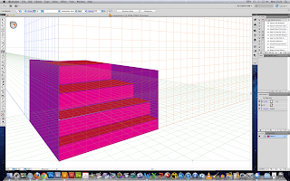
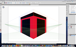
This is my first attempt at creating buildings on Adobe Illustrator. I used a perspective grid to help me and guide me on how to position my building. I found this easier to draw on Illustrator rather than free hand.

Monday, 10 October 2011

Main Idea

"Downgrade"

A young, rich girl who becomes in debt from all her shopping spree's and gets kicked out of her luxurious apartment, breaks up with her millionaire boyfriend and is forced to live a downgrade of a lifestytle. The story follows her struggles to adjust to her new life and how whether she makes it out alive.

The story is a fun, uplifting rom-com about a bubbly fun girl who just got hit by reality.


-- Title Sequence

In animation, the main character is walking through a city. Passing shops like Gucci and other designer stores, it looks like she's living a life of luxury. She opens her apartment door to find a top class apartment. She looks stunned, then to rub her eyes a find a grotty, small room.

A arrow drops down from the top to form the 'D' of the title "Downgrade"

Motion Graphics Brief

The brief i have chose is:

2 “environments” that you need to transition between – the title style has to work in both environments.
The sequence should be 2-3-mins.
Create many reflections and integrate the visuals between the cast members’ names and the worlds they are in.

Generating Ideas

Ideas

Here are a few ideas that i have come up with that i would like to experiment with and try out.

1. Animated sequence, then when introducing character/objects, they turn into real life animation with the characters names beside them.
Inspired by: The Back up plan, Juno

2. A real life animation book, which when is opened captivates the audience by the animated objects.

3. A range of animated objects that turn silhouette when touched by the character.

4. A silhouette of the main character falling through a nightmare of her life, which could be in either real life or animated. The mood of the film will be identified through the use of music and colours.
Inspired by Mad Men

Wednesday, 5 October 2011

Research

I have been exploring different styles of how motion graphics are demonstrated.

Saul Bass is known to be a very successful motionographer. His work was very interesting as it was mostly non narrative based. Instead, he used shapes to set the mood of the film, or important objects that link to the film, rather than tell a story.

One of my favourite styles is the flip book/comic book style. I found that this style allows you to be very creative and artistic.

An example of work i have seen was designed and created by Michael Riley for the opening title of 'The Back-up Plan' directed Alan Poul.

Link: http://www.watchthetitles.com/articles/00177-The_Back_up_Plan


Michael Riley is the creative director of Shine Studios but has also done work for Dreamworks. He designed the title for Kung Fu Panda which was completely different to The Back Up Plan. He explored many different styles and techniques through the different title designs he has created.
You are able to tell straight away what kind of genre of film you will be watching when you watch the title sequence. The upbeat music and powerful bright colours used instantly tells you the film will be a type of comedy.


Another designer that i researched is Paul Donnellon, one of the founders of VooDooDog. He has created titles for St. Trinians, Nanny McPhee and many more. I feel his work has a hand craft feel rather than pure computer designed.

He has worked with many companies, such as, Columbia Pictures, Fox, New Line Cinema, Paramount, HBO, MTV, BBC, SKY and many many more.

The title sequence that captivated me was for Nanny McPhee and the Big Bang. Some of the characters where first created in 2D then hand made which made them stand out.

Link: http://www.watchthetitles.com/articles/00192-Nanny_McPhee_and_the_Big_Bang


The title sequence for Juno is also rather interesting. I like the way the sequence integrates the animated part with the real life part. I think it works really well as it does not look odd and flows in a smooth motion.

The sequence was completely hand made, even the typography, which must have taken a lot of time and effort.

The frames were printed and cut out, then printed several times to get a degraded copy.